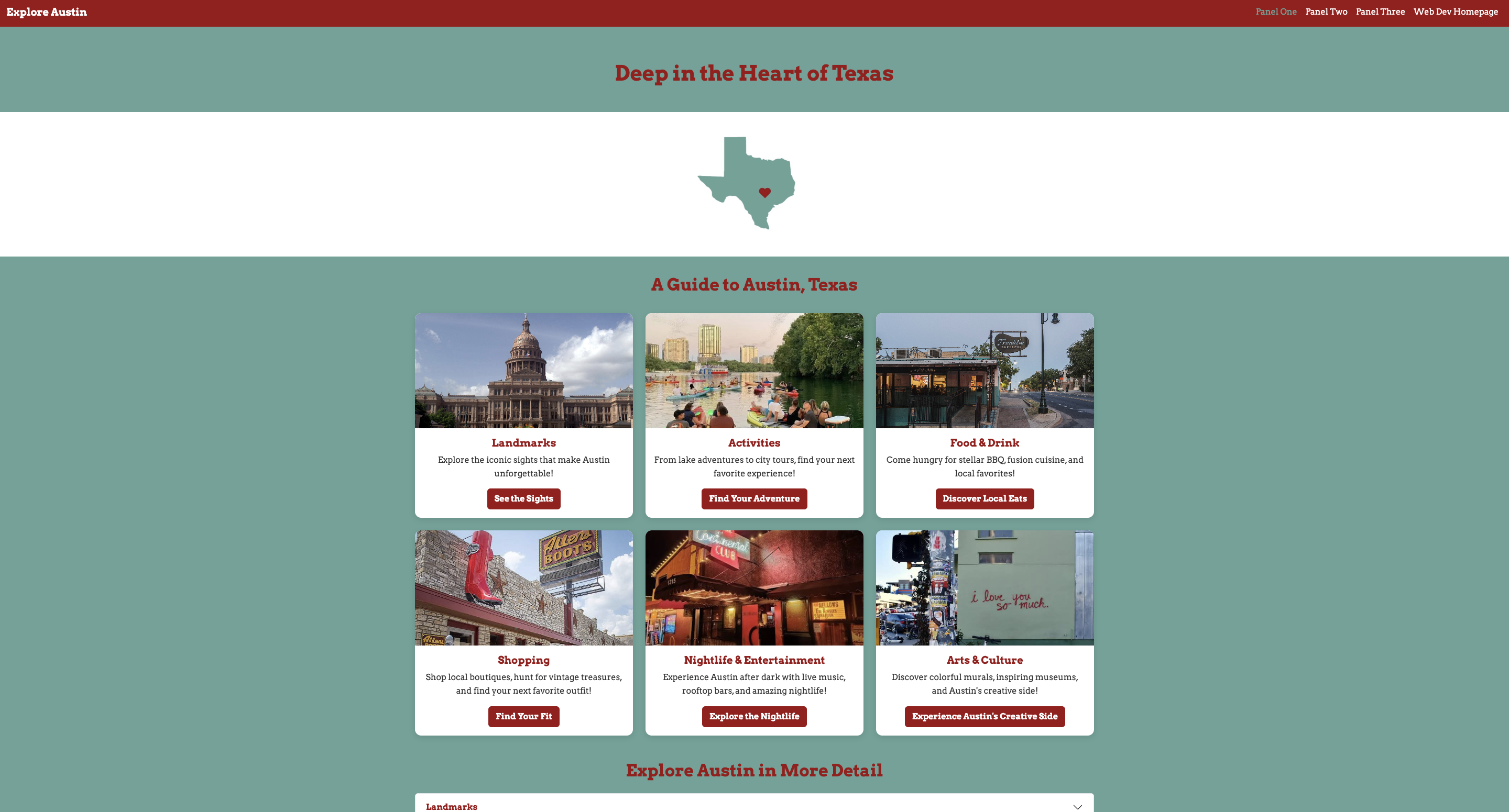
Developing my Project 2 Panel One webpage was an enjoyable and rewarding experience. I was able to create a webpage about a topic I am genuinely interested in, which made me excited to share my work with others. I creatively incorporated Bootstrap components, including a responsive navbar with a toggler and collapse feature, a responsive grid, cards, buttons, images, and an accordion to make my Austin travel guide both visually appealing and easy to navigate. I also focused on creating a cohesive design by coordinating colors, fonts, and images to complement my topic and maintain a consistent aesthetic throughout the webpage. One challenge I faced was formatting the cards consistently and connecting the card buttons to the appropriate sections of the accordion. Through troubleshooting and making adjustments to my code, I was able to resolve these issues and improve the website's functionality. I am especially proud of how the individual components work together to create an organized, engaging, and responsive travel guide. This project helped me strengthen my understanding of Bootstrap and develop my problem-solving skills, and I am excited to continue building on these skills in future web development projects.
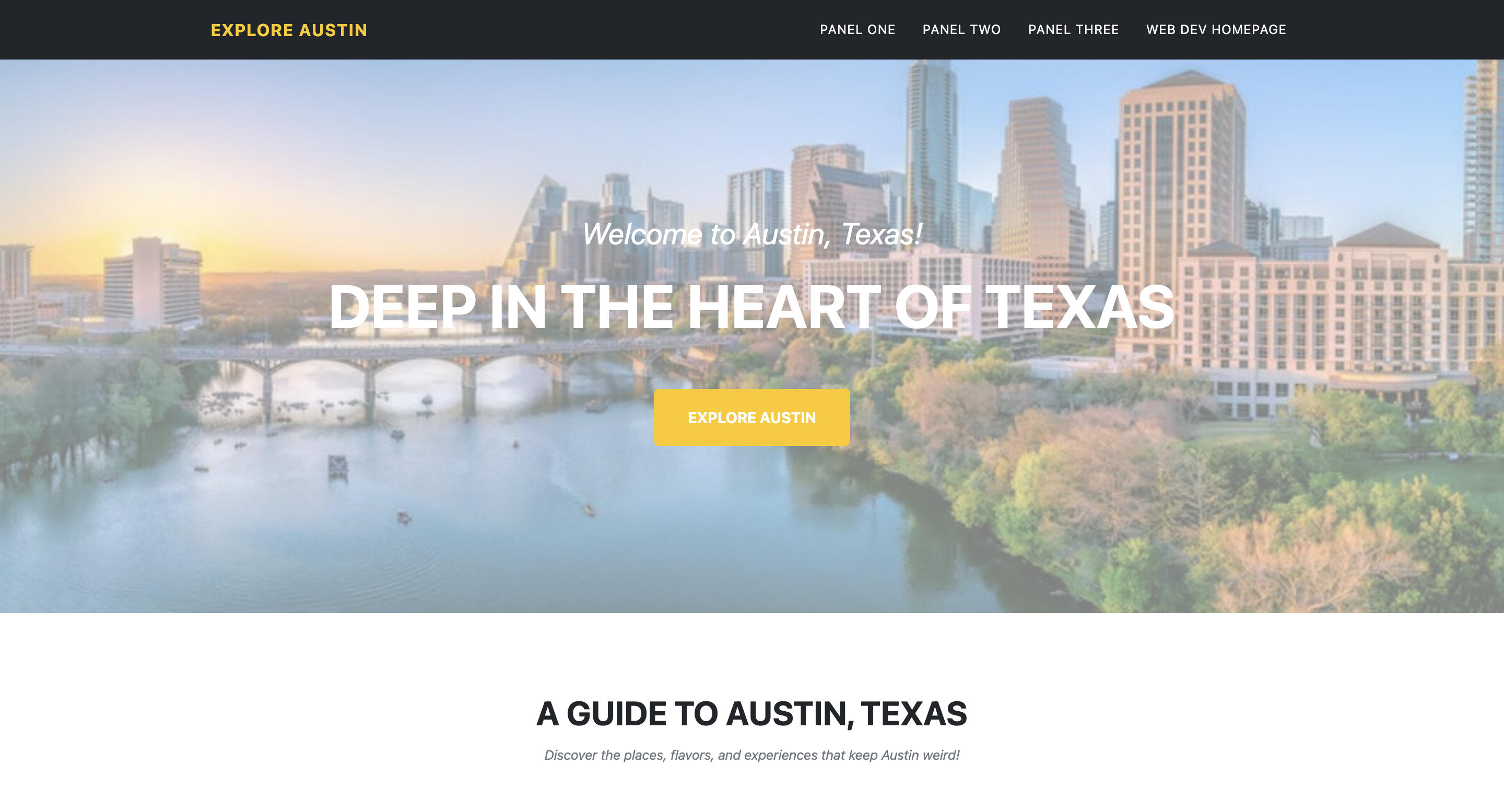
Creating my Project 2 Panel Two webpage was a great opportunity to learn how to choose a Bootstrap theme that complements my content. After searching through the available themes, I decided on one that I felt displayed my content in an aesthetically pleasing and easily digestible manner. I wanted to make sure that the layout worked well with my Austin travel guide and allowed visitors to navigate the different categories without feeling overwhelmed by information. I found it slightly difficult to work through the extensive HTML code and determine which components I wanted to keep and which I wanted to remove to highlight my content in the best way possible. I had to carefully review the existing template and decide which sections were relevant to my webpage and which ones were unnecessary for my overall design. Despite this, I enjoyed learning how to work with an existing Bootstrap theme and incorporate my own text and images to make the webpage fit my topic. I am proud of how I was able to transform a predesigned template into a webpage that reflects my interests while maintaining a cohesive and organized layout. This experience taught me the importance of choosing a theme that complements the purpose of a website and helped me become more comfortable navigating and editing HTML code!
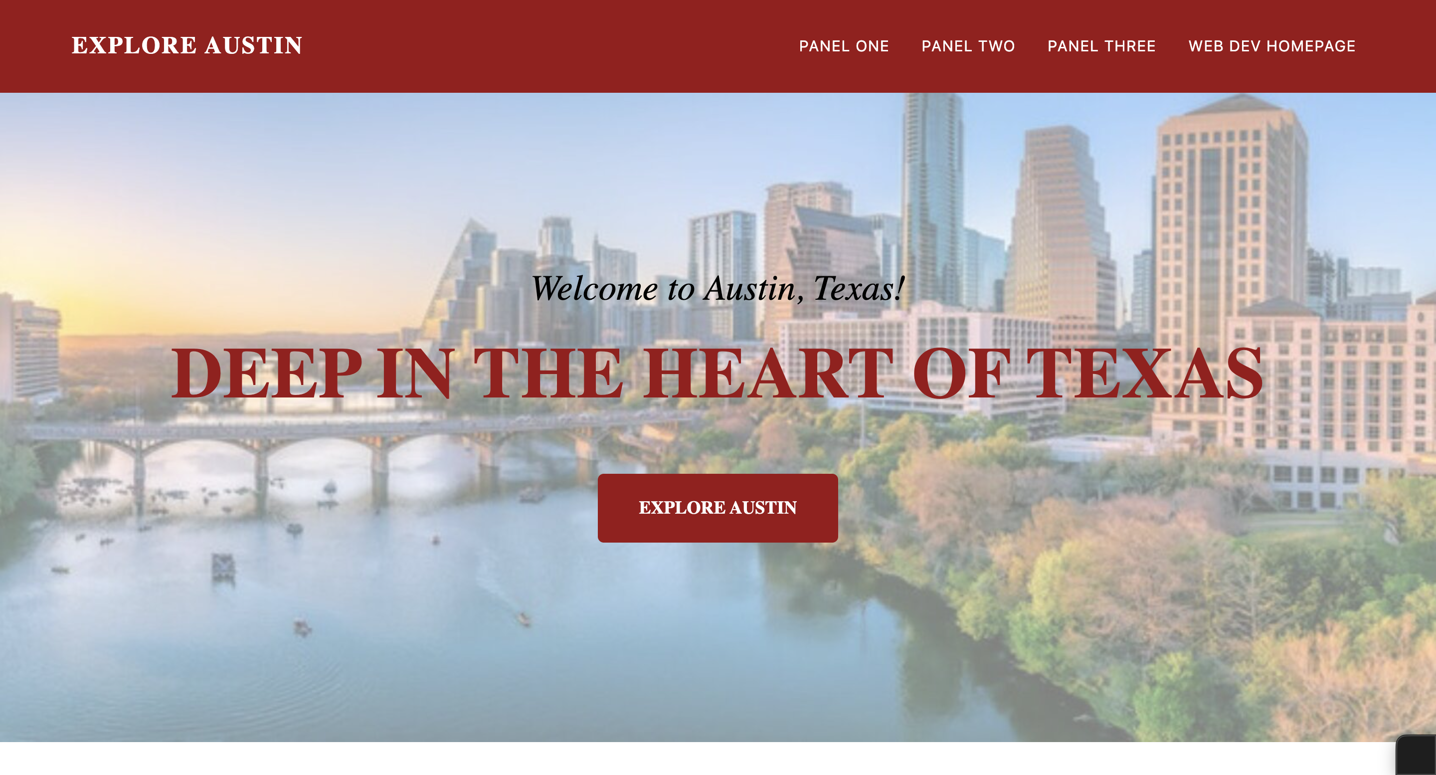
Through the creation of my Project 2 Panel Three webpage, I was able to take my Panel Two webpage a step further and make it reflect my own personal design preferences. In this panel, I created a custom CSS stylesheet that allowed me to change the formatting and styling of my webpage to better match the vision I had for my Austin travel guide. I was able to customize elements such as the colors, fonts, navigation bar, buttons, and card images to create a more cohesive and visually appealing design. I really enjoyed having the creative freedom to experiment with different styling choices and make the webpage feel more personalized! I found some difficulties figuring out which CSS properties to change and how to make sure my custom styles worked correctly with the existing Bootstrap theme. I also had to troubleshoot certain formatting details to ensure that the different elements of my webpage looked consistent and worked well together. Despite this, I was able to work through these challenges and develop a better understanding of how CSS can be used to customize a website's appearance. I am especially proud of how I transformed my Panel Two webpage into a design that better reflects my aesthetic preferences while maintaining its original functionality. This experience helped me strengthen my CSS skills and showed me how even small styling changes can make a significant difference in the overall look and feel of a website!